Ergon Foods
2. Mjesto Tipografije
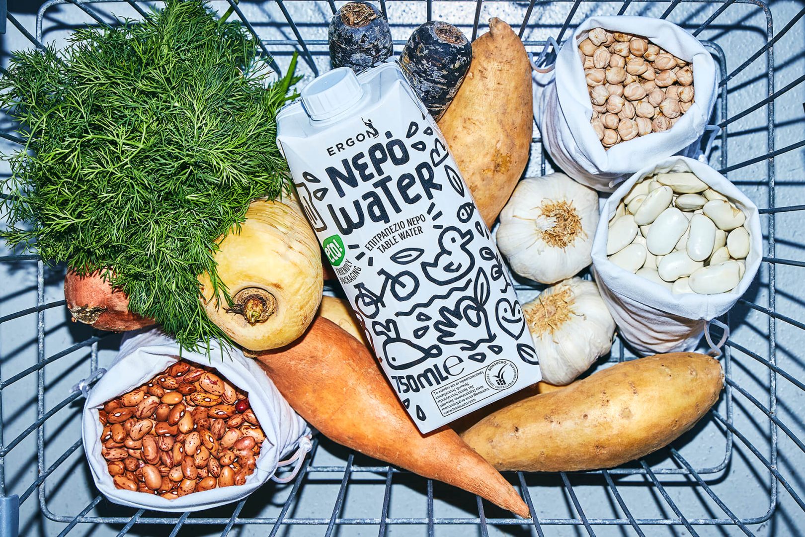
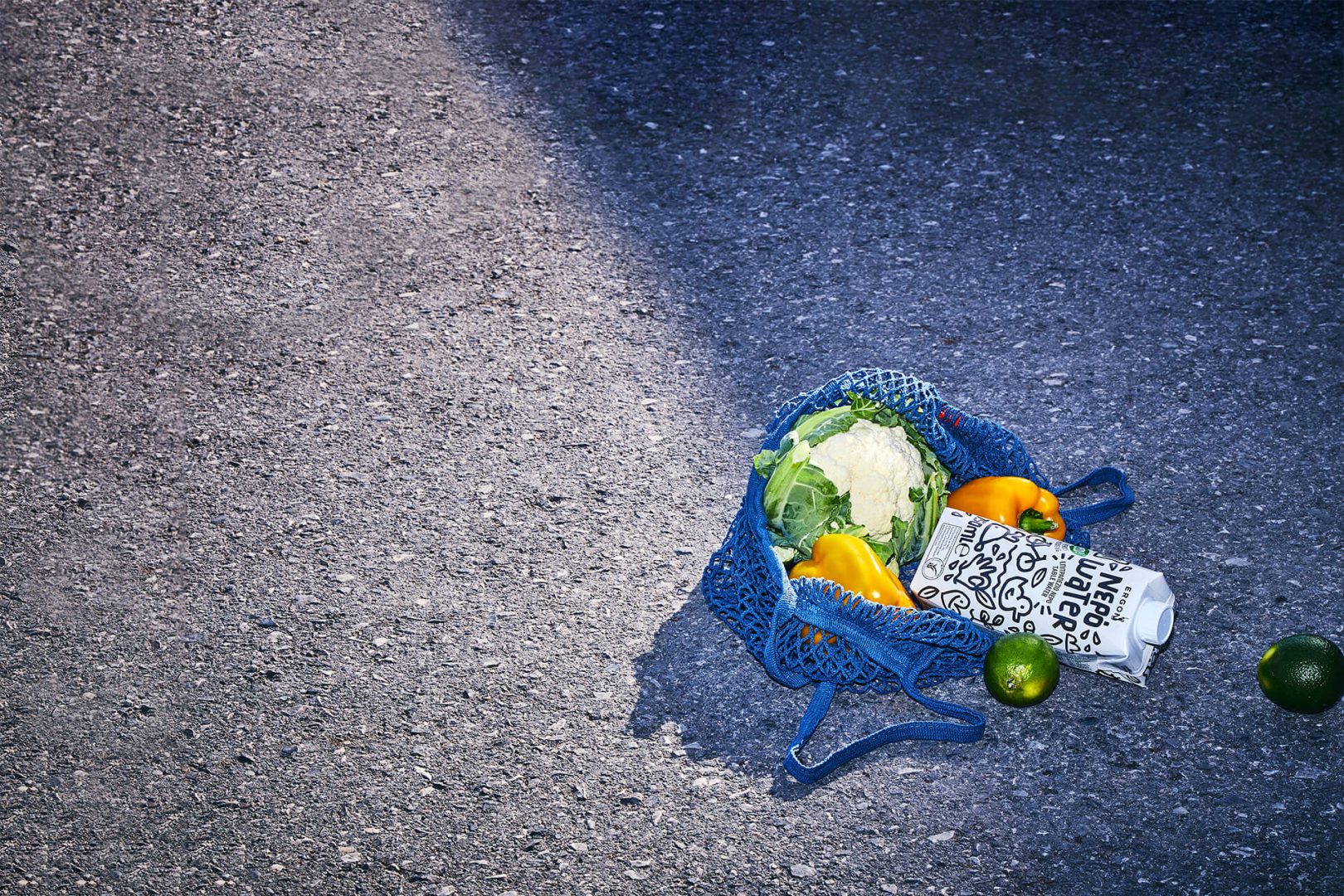
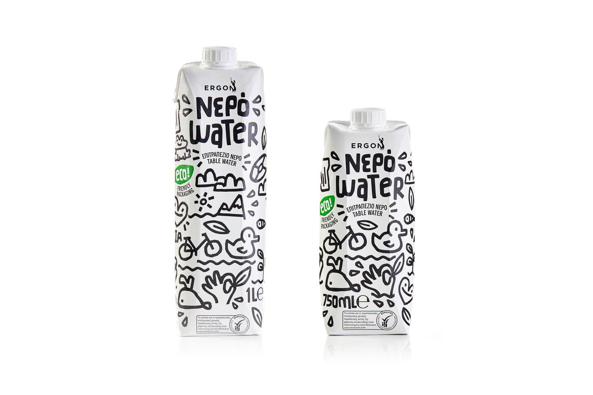
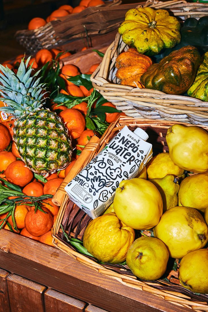
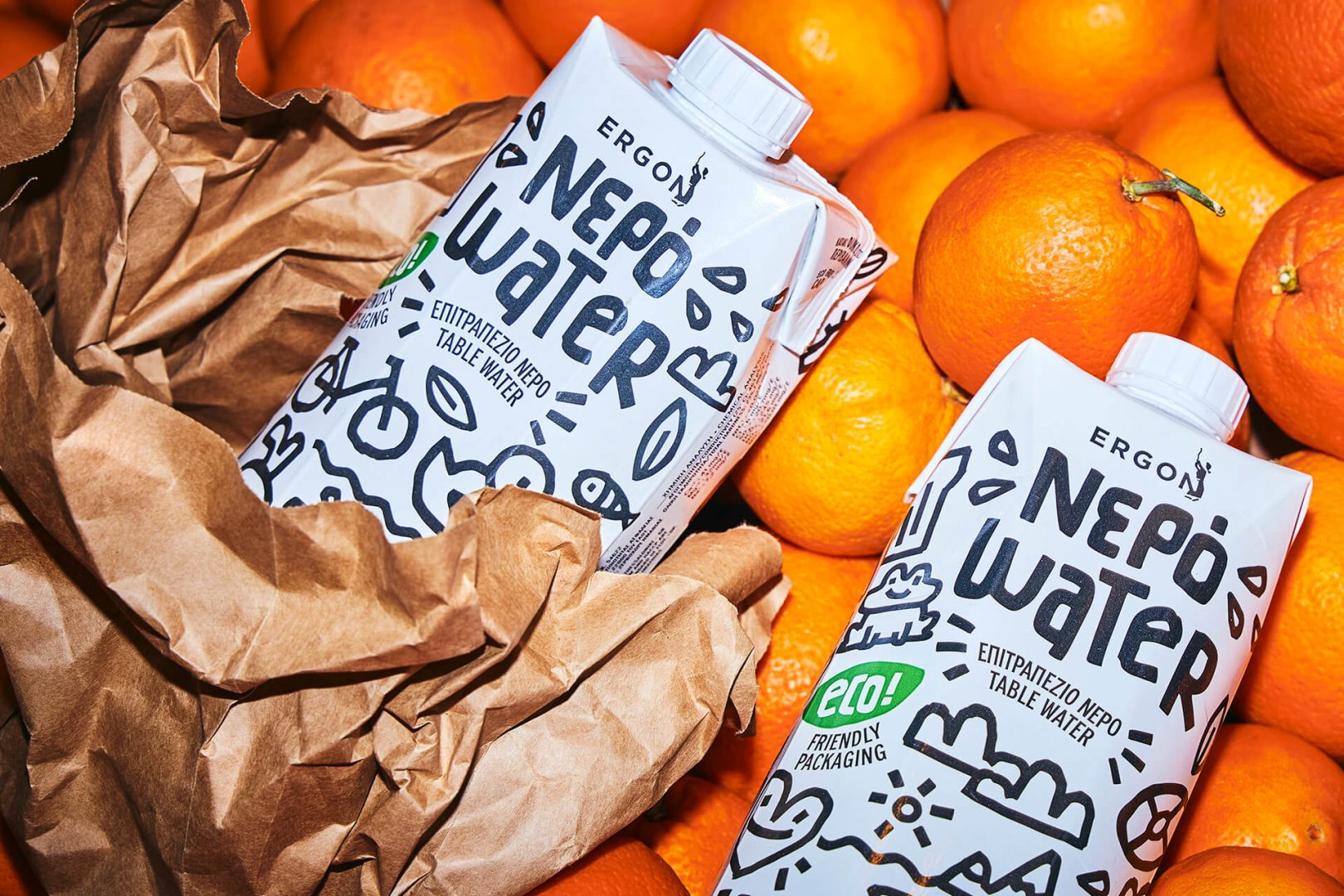
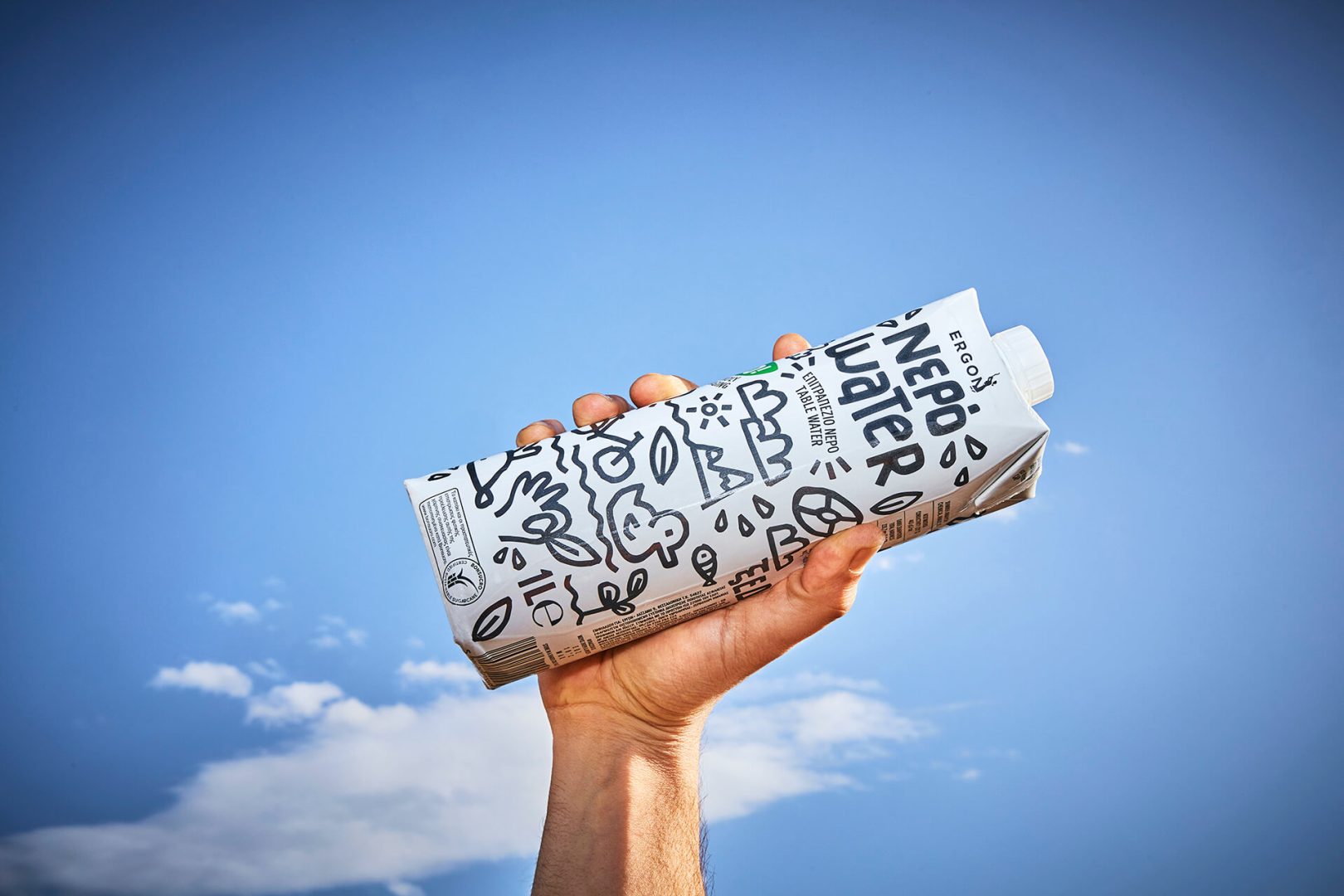
Message in a bottle.All around the globe people identify water packaging with clear plastic. Bottled water is one of the most widely-consumed goods, yet few of us are conscious of how much plastic is the byproduct waste, for satisfying the most common of needs, drinking water. Getting on board this project with ERGON Foods, we felt really excited to be touching upon something brand new, a fresh idea that could help disrupt peoples’ rooted perception of water packaging and most importantly – help the planet while doing so. As expected, we were then met with the concern that is created from the same fact. If everyone thinks packaged water is to be found in plastic bottles, how do you break that stereotype and convince them to get water in a carton box? During the design process, we had to eliminate all design elements that a consumer typically links to other drinks packaged in carton. For example vibrant colours could be linked to juice, or the depiction of a valley or similar landscapes could be linked to milk. In order to communicate that the fact that this is a fresh concept that seeks to be a paradigm shift, we had to use bold, clear shapes and forms, along a very limited palette.