90s Movie Posters and Their Illustration
3. mjesto Ilustracija
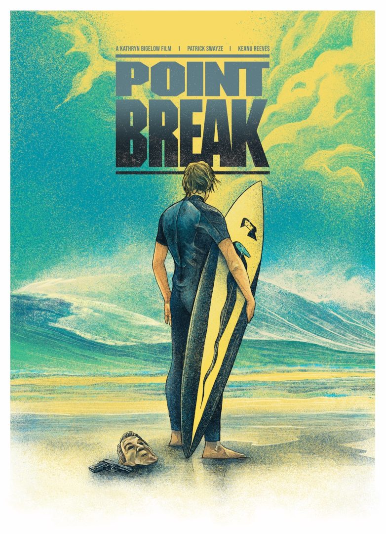
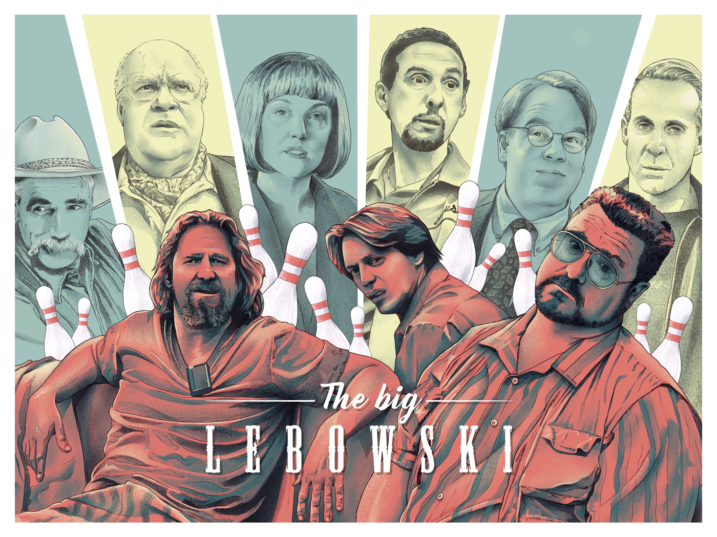
Discover Chris Dibenedetto’s unique 90s movie posters. Learn how his use of color, negative space, and storytelling creates powerful illustration compositions. Chris Dibenedetto’s alternative movie posters breathe new life into beloved 90s films, capturing their essence through a unique blend of color, negative space, and storytelling. Dibenedetto’s work stands out in the field of graphic design, not only for its artistic merit but also for its ability to resonate deeply with fans of these classic films. Each poster is a homage to the vibrant era of the 90s, a time when films ranged from gritty and raw to whimsical and fantastical. Dibenedetto believes in telling a story with every illustration, aiming to draw viewers into the world of the film. By integrating key elements from the movies, his illustrations evoke the same emotions that the films did, creating a strong connection between the artwork and its audience. Color plays a pivotal role in Dibenedetto’s creative process. Each hue is carefully selected to evoke the feelings associated with watching the film. This deliberate use of color acts as a subtle yet powerful bridge between the cinematic experience and the illustrative art form. For example, the soft, pastel hues in his “White Men Can’t Jump” poster capture the laid-back yet competitive spirit of the film, while the bold, contrasting colors in his “Point Break” poster reflect the intense and thrilling nature of the movie.