Typography Merge in Card Design
1. Mjesto Tipografija
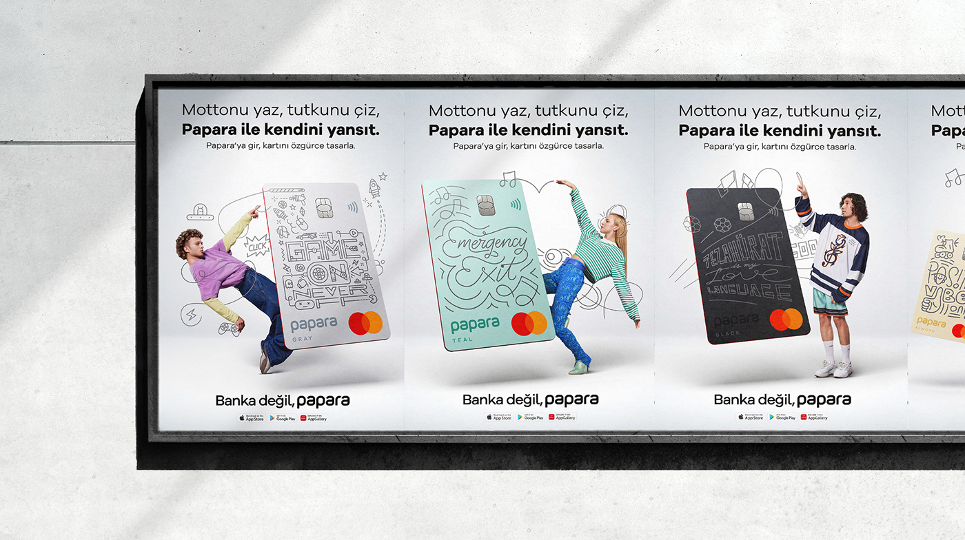
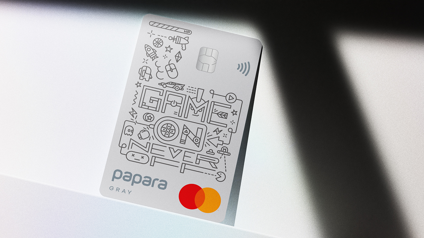
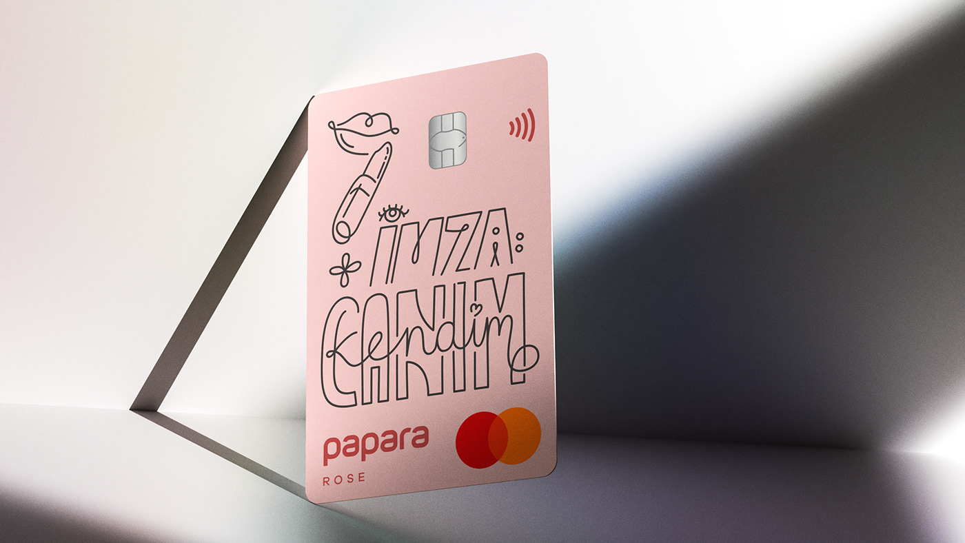
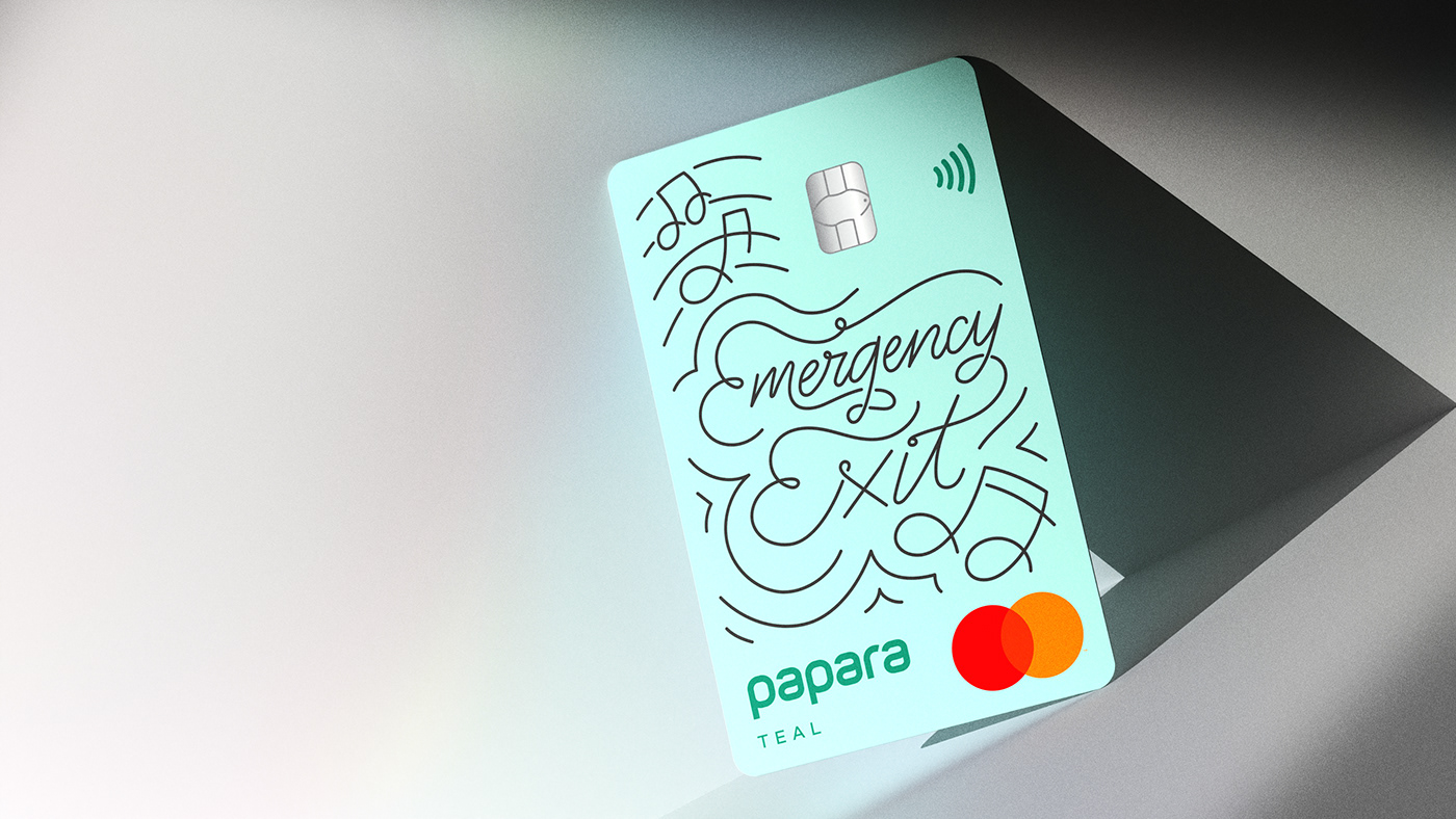
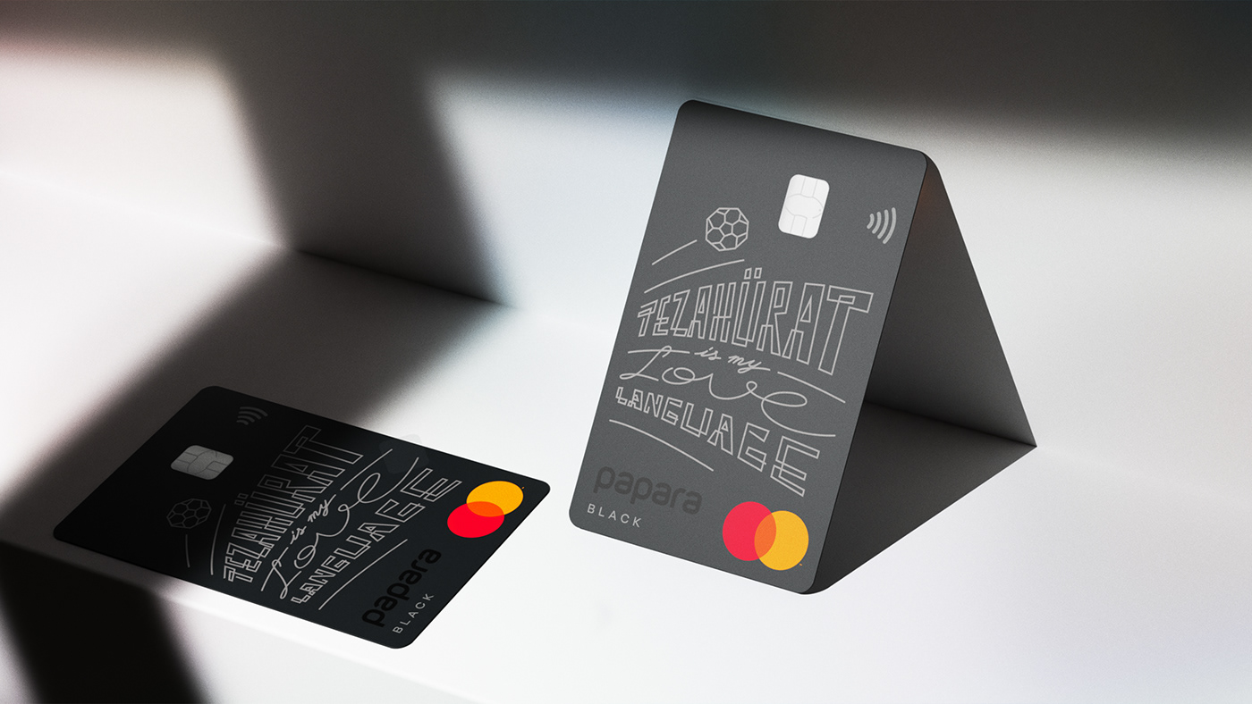
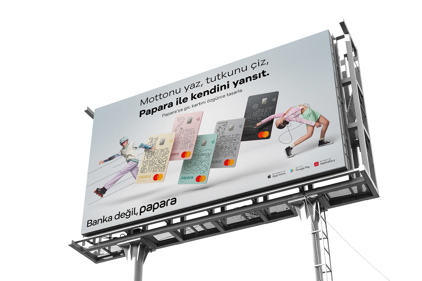
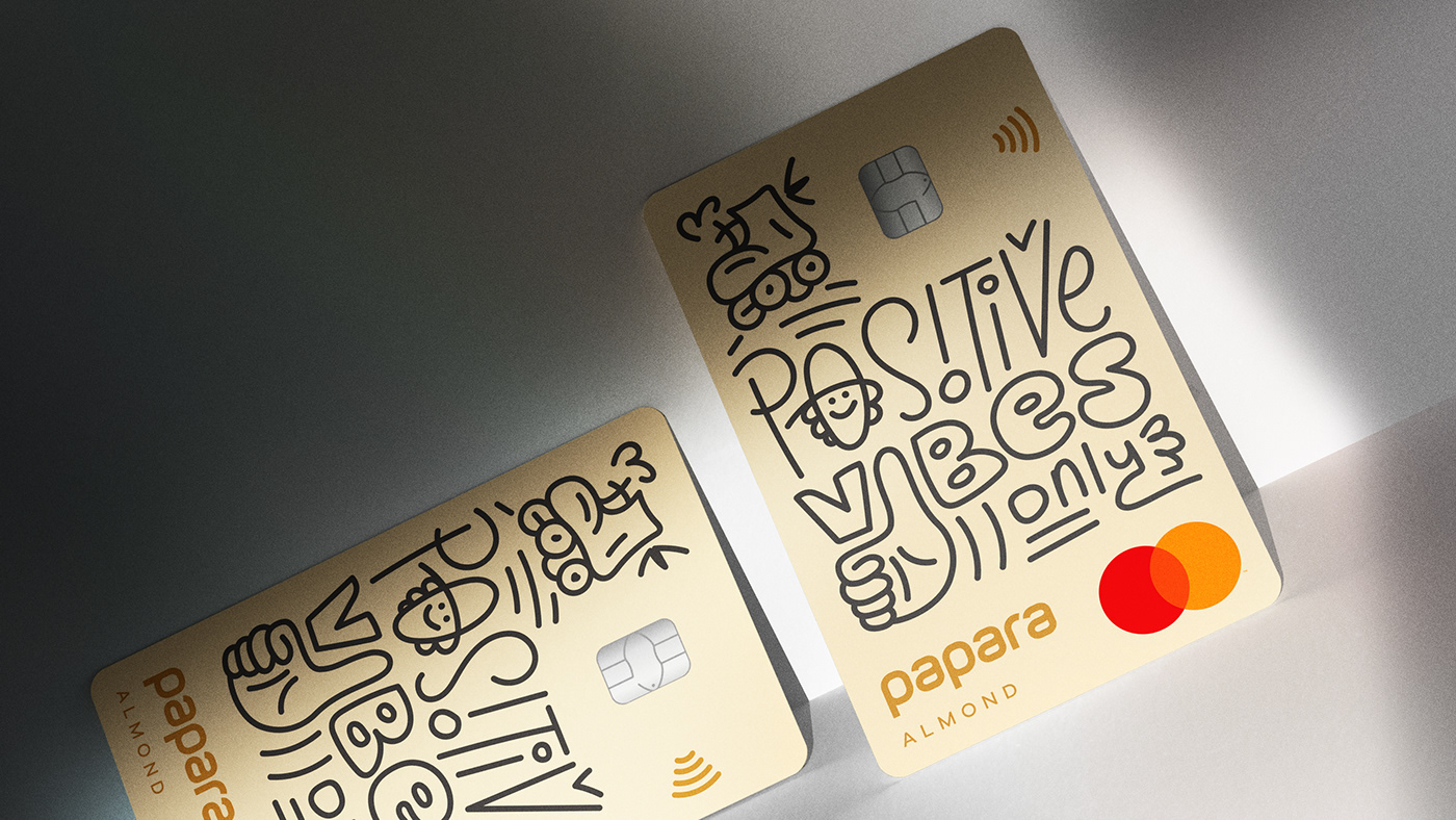
Discover the art of Papara Card’s design, melding illustration and typography into customizable financial products for Gen Z. In the vibrant landscape of financial technology, one brand stands out with its latest endeavor – Papara. Targeting the pulse of Gen Z, Papara has unveiled a product that is as much a financial tool as it is a canvas for self-expression: the customizable card. For young consumers eager to brandish their uniqueness, this card is not merely a transactional piece but a statement of identity. The campaign, backed by the inventive minds at 4129Grey, takes a bold leap with its slogan, “Write your motto, draw your passion.” It’s a clarion call for users to see their cards as an extension of their individuality. The designs, crafted by the artful hands at Arti Stüdyo, serve as a testament to the myriad of personalities that Papara caters to. Illustration and typography converge, creating designs that resonate deeply with the users’ spirits. These personalized artistic expressions are not confined to the cards; they breathe life into the entire campaign – from film to posters, capturing the essence of individuality. The production of the campaign film was helmed by Riders, who translated the campaign’s vision onto the screen with finesse. Meanwhile, Emre Ünal’s photographic expertise added a layer of intrigue to the posters, each snapshot a homage to the distinctive character they represent.